How can I create a navigation bar like this:
Assuming you know how to hide long navbar for mobiles, it’s fairly simple to build a simple navbar for mobile. First thing first, position this svg in your navbar wrapper. This is the bar icon(from heroicons), you can change it with image according to your preference.
<svg xmlns="http://www.w3.org/2000/svg" fill="none" viewBox="0 0 24 24" stroke-width="1.5" stroke="currentColor" onclick="changeNav()">
  <path stroke-linecap="round" stroke-linejoin="round" d="M3.75 6.75h16.5M3.75 12h16.5m-16.5 5.25h16.5" />
</svg>
We added an onclick function referring to a changeNav function which we’ll assign in js part; I’ll leave styling it upto you.
Now create a ulelement which holds our links, likewise:
<ul class="navmenu">
  <li><a class="active" href="/home">Home</a></li>
  <li><a href="/news">News</a></li>
  <li><a href="/contact">Contact</a></li>
  <li><a href="/about">About</a></li>
</ul>
Reason we use <ul> & <li> over simple <div> and <a> is because li is a list element which automatically aligns itself one after another and is more suitable in this case.
Now we’ll style the element using navmenu class we’ve assigned to it:
Tip: keep it hidden using
display:none.
.navmenu {
  position: absolute;
  width: 65%; height:100%;
  top: 0%; right: 0%;
  list-style-type: none;
  margin: 0;
  padding: 0;
  overflow: auto;
  display: none;
}

.navmenu a {
  display: block;
  padding: 8px 16px;
  text-decoration: none;
}
That’s it!! Again I’ve left many things to style upto you. Moving onto js part:
//remember the navChange() function, we declared earlier?

//this variable stores if nav is close or open
var navState = false;

function navChange() {
  //we fetch the menu first
    const menu = document.getElementsByClassName("navmenu")[0];

  // if nav is open, close it and set navState to false
  if(navState) {
    menu.style.display = "none";
    navState = false;
  } else {
  //else open the nav and set navState to true
    menu.style.display = "block";
    navState = true;
  }
}
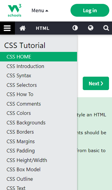
I tried to leave it as much as possible upto your creativity. For a slight different approach, try the one by w3schools: CSS Vertical Navigation Bar
Note: Don’t forget to hide this on computer screens using css media-query breakpoints if it targets only mobile users.
2 Likes